
Adjusting HTML Table Column Width for Better Design

February 22, 2024
This post shows you how to adjust the table width on your HTML tables.
Inline styles and the width attribute
Directly setting the width of a table column in HTML is possible through either the width attribute or inline styles. While the width attribute offers a straightforward method to define column widths, it falls out of favor in contemporary web development due to its limited flexibility. Inline styles, on the other hand, are widely adopted for their versatility.
Using the width attribute:
<table>
  <tr>
    <td width="100">First column</td>
    <td width="200">Second column</td>
  </tr>
</table>
Applying inline styles:
<table>
  <tr>
    <td style="width: 100px;">First column</td>
    <td style="width: 200px;">Second column</td>
  </tr>
</table>
CSS for advanced styling
Leveraging CSS to manage table column widths is the go-to approach for achieving dynamic and responsive table designs. This method not only cleans up your HTML by separating the styling but also enhances flexibility across different devices and screen sizes.
Implementing CSS:
/* Targets all cells in the first column */
table td:first-child {
  width: 100px;
}

/* Targets all cells in the second column */
table td:nth-child(2) {
  width: 200px;
}
Incorporate these styles by including them within a <style> tag in the HTML document's <head> section or by linking to an external stylesheet.
How to implement responsive tables in HTML?
Adopting percentages or utilizing CSS functions like minmax() in a CSS Grid layout facilitates responsive table designs. This strategy allows tables to adapt gracefully across various display sizes.
Using percentages for fluid layouts:
table td:first-child {
  width: 25%;
}
table td:nth-child(2) {
  width: 75%;
}
Integrating CSS Grid with minmax():
table {
  display: grid;
  grid-template-columns: minmax(100px, auto) minmax(200px, auto);
}
Here, the grid layout assigns a minimum width to each column, allowing them to expand as needed to fill the available space, ensuring that your tables are both functional and visually appealing on any device.
Contents
February 22, 2024
This post shows you how to adjust the table width on your HTML tables.
Inline styles and the width attribute
Directly setting the width of a table column in HTML is possible through either the width attribute or inline styles. While the width attribute offers a straightforward method to define column widths, it falls out of favor in contemporary web development due to its limited flexibility. Inline styles, on the other hand, are widely adopted for their versatility.
Using the width attribute:
<table>
  <tr>
    <td width="100">First column</td>
    <td width="200">Second column</td>
  </tr>
</table>
Applying inline styles:
<table>
  <tr>
    <td style="width: 100px;">First column</td>
    <td style="width: 200px;">Second column</td>
  </tr>
</table>
CSS for advanced styling
Leveraging CSS to manage table column widths is the go-to approach for achieving dynamic and responsive table designs. This method not only cleans up your HTML by separating the styling but also enhances flexibility across different devices and screen sizes.
Implementing CSS:
/* Targets all cells in the first column */
table td:first-child {
  width: 100px;
}

/* Targets all cells in the second column */
table td:nth-child(2) {
  width: 200px;
}
Incorporate these styles by including them within a <style> tag in the HTML document's <head> section or by linking to an external stylesheet.
How to implement responsive tables in HTML?
Adopting percentages or utilizing CSS functions like minmax() in a CSS Grid layout facilitates responsive table designs. This strategy allows tables to adapt gracefully across various display sizes.
Using percentages for fluid layouts:
table td:first-child {
  width: 25%;
}
table td:nth-child(2) {
  width: 75%;
}
Integrating CSS Grid with minmax():
table {
  display: grid;
  grid-template-columns: minmax(100px, auto) minmax(200px, auto);
}
Here, the grid layout assigns a minimum width to each column, allowing them to expand as needed to fill the available space, ensuring that your tables are both functional and visually appealing on any device.
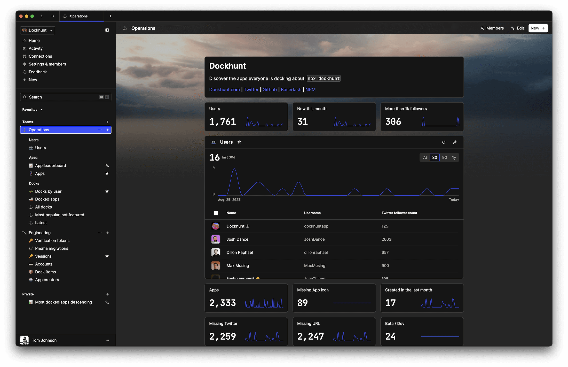
What is Basedash?
What is Basedash?
What is Basedash?
Ship faster, worry less with Basedash
Ship faster, worry less with Basedash
Ship faster, worry less with Basedash
You're busy enough with product work to be weighed down building, maintaining, scoping and developing internal apps and admin panels. Forget all of that, and give your team the admin panel that you don't have to build. Launch in less time than it takes to run a standup.
You're busy enough with product work to be weighed down building, maintaining, scoping and developing internal apps and admin panels. Forget all of that, and give your team the admin panel that you don't have to build. Launch in less time than it takes to run a standup.
You're busy enough with product work to be weighed down building, maintaining, scoping and developing internal apps and admin panels. Forget all of that, and give your team the admin panel that you don't have to build. Launch in less time than it takes to run a standup.
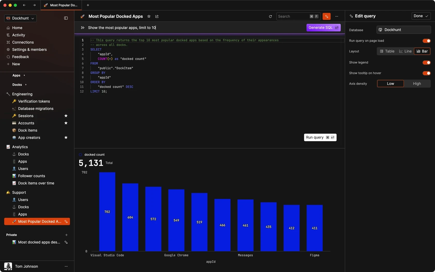
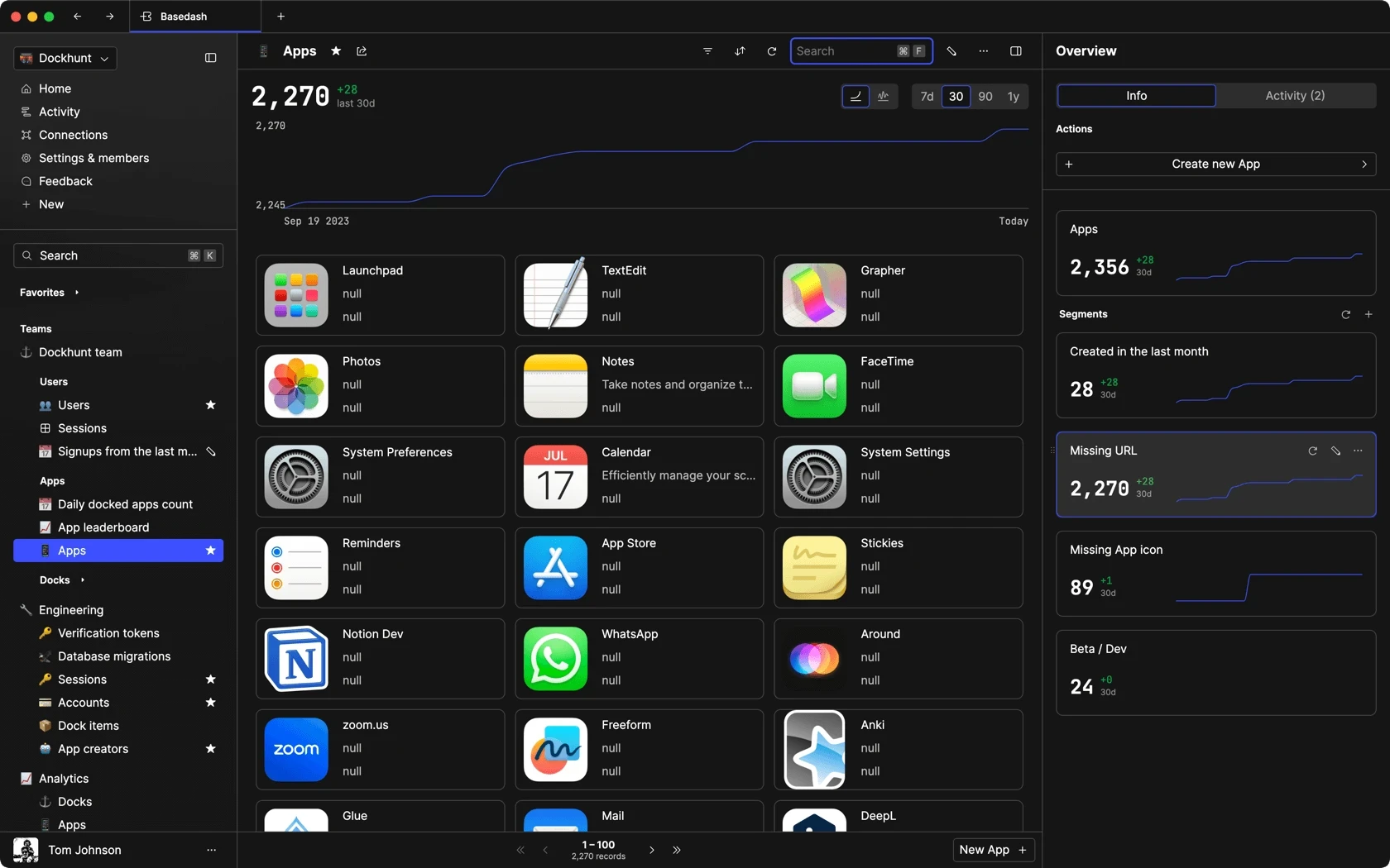
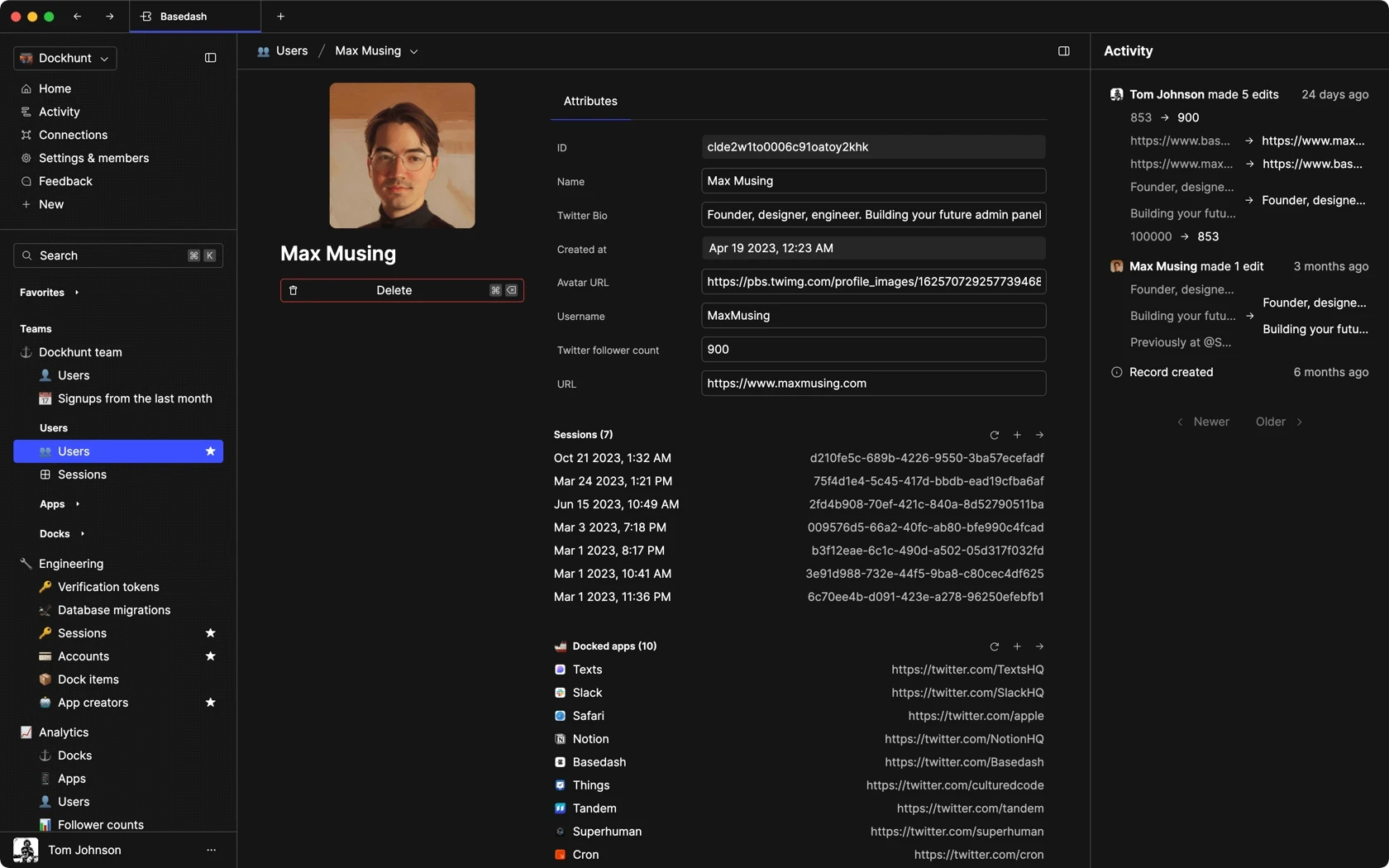

Dashboards and charts
Edit data, create records, oversee how your product is running without the need to build or manage custom software.
USER CRM
ADMIN PANEL
SQL COMPOSER WITH AI
Related posts
Related posts
Related posts

How to Center a Table in HTML with CSS
Jeremy Sarchet

How to Link Multiple CSS Stylesheets in HTML
Robert Cooper

Mastering HTML Table Inline Styling: A Guide
Max Musing

HTML Multiple Style Attributes: A Quick Guide
Max Musing

How to Set HTML Table Width for Responsive Design
Max Musing

Mastering HTML Span Style for Text Customization
Jeremy Sarchet