Building a Responsive Footer: A Guide to HTML and CSS Techniques
February 13, 2024
Creating a responsive html css footer is a fundamental skill for web developers, ensuring that the website's bottom section enhances the user experience and looks great on any device. The footer, typically containing important information like contact details, copyright notices, and quick links, plays a crucial role in website navigation and aesthetics. This guide will walk you through crafting a simple yet adaptable footer code in html and css, reinforcing the functionality and design of your site.
What is the basic structure for an HTML footer?
To start, you'll need to establish the HTML structure of your footer using semantic HTML5 elements to boost accessibility and SEO. This is the foundation of your footer html css template.
<footer class="site-footer">
  <div class="container">
    <div class="footer-about">
      <h3>About Us</h3>
      <p>Our mission is to deliver exceptional web experiences.</p>
    </div>
    <div class="footer-links">
      <h3>Quick Links</h3>
      <ul>
        <li><a href="#">Home</a></li>
        <li><a href="#">Services</a></li>
        <li><a href="#">About</a></li>
        <li><a href="#">Contact</a></li>
      </ul>
    </div>
    <div class="footer-contact">
      <h3>Contact Us</h3>
      <p>Email: info@example.com</p>
      <p>Phone: +123 456 7890</p>
    </div>
  </div>
</footer>
You could ship faster.
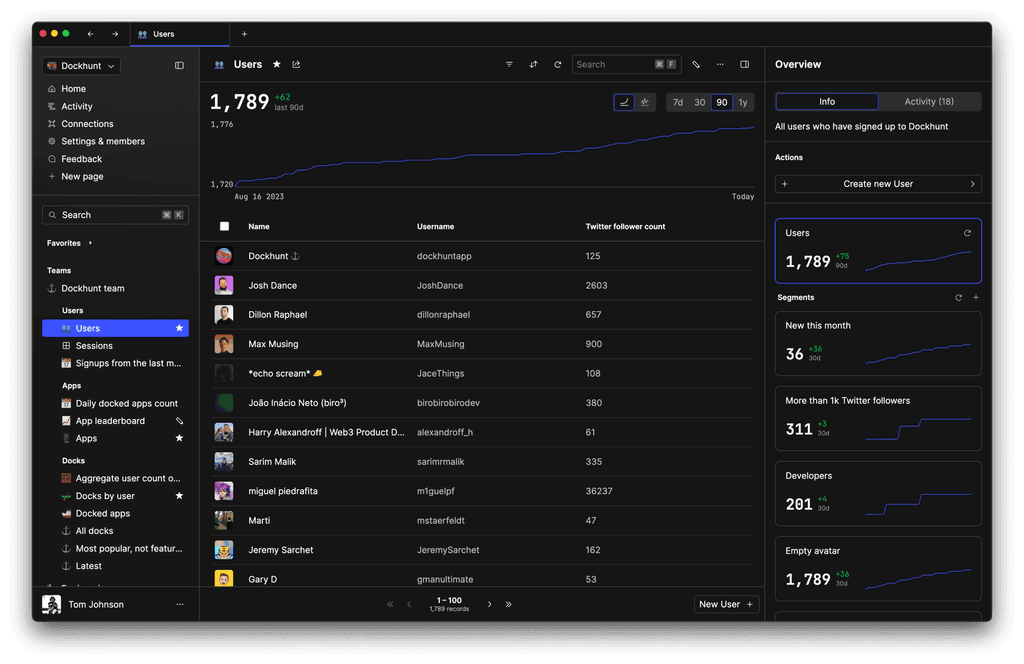
Imagine the time you'd save if you never had to build another internal tool, write a SQL report, or manage another admin panel again. Basedash is built by internal tool builders, for internal tool builders. Our mission is to change the way developers work, so you can focus on building your product.
How should you style your HTML footer using CSS?
With your HTML in place, the next step is to apply CSS styling to your footer. This step is crucial in turning your basic structure into a visually appealing and functional footer code in html and css. Flexbox or CSS Grid are both great choices for creating flexible layouts that adjust to screen sizes. For simplicity, we'll use Flexbox.
.site-footer {
  background-color: #333;
  color: white;
  padding: 20px 0;
}

.container {
  display: flex;
  flex-wrap: wrap;
  justify-content: space-between;
  padding: 0 15px;
}

.footer-about, .footer-links, .footer-contact {
  flex: 1;
  min-width: 200px;
  margin-bottom: 20px;
}

.footer-links ul {
  list-style: none;
  padding: 0;
}

.footer-links ul li a {
  color: #fff;
  text-decoration: none;
}

h3 {
  margin-top: 0;
}
This CSS code provides a sleek, dark background to your footer, ensuring that text stands out in white, and uses Flexbox to organize the content effectively. It transforms the basic structure into a stylish footer html css template, adaptable to various screen sizes.
How can you make your footer responsive?
A responsive design is key to ensuring your html css footer looks good on all devices. Media queries allow you to adjust the layout for smaller screens, making your footer flexible and user-friendly.
@media (max-width: 600px) {
  .container {
    flex-direction: column;
    align-items: center;
  }

  .footer-about, .footer-links, .footer-contact {
    min-width: 100%;
    text-align: center;
  }
}
This media query adapts the footer layout to stack the content vertically and align it in the center on screens less than 600px wide, ensuring your footer remains functional and aesthetically pleasing even on mobile devices.
By following these steps, you create an essential part of your website with a responsive html css footer that not only adds to the visual appeal but also enhances navigation and accessibility across different devices.
TOC
February 13, 2024
Creating a responsive html css footer is a fundamental skill for web developers, ensuring that the website's bottom section enhances the user experience and looks great on any device. The footer, typically containing important information like contact details, copyright notices, and quick links, plays a crucial role in website navigation and aesthetics. This guide will walk you through crafting a simple yet adaptable footer code in html and css, reinforcing the functionality and design of your site.
What is the basic structure for an HTML footer?
To start, you'll need to establish the HTML structure of your footer using semantic HTML5 elements to boost accessibility and SEO. This is the foundation of your footer html css template.
<footer class="site-footer">
  <div class="container">
    <div class="footer-about">
      <h3>About Us</h3>
      <p>Our mission is to deliver exceptional web experiences.</p>
    </div>
    <div class="footer-links">
      <h3>Quick Links</h3>
      <ul>
        <li><a href="#">Home</a></li>
        <li><a href="#">Services</a></li>
        <li><a href="#">About</a></li>
        <li><a href="#">Contact</a></li>
      </ul>
    </div>
    <div class="footer-contact">
      <h3>Contact Us</h3>
      <p>Email: info@example.com</p>
      <p>Phone: +123 456 7890</p>
    </div>
  </div>
</footer>
You could ship faster.
Imagine the time you'd save if you never had to build another internal tool, write a SQL report, or manage another admin panel again. Basedash is built by internal tool builders, for internal tool builders. Our mission is to change the way developers work, so you can focus on building your product.

How should you style your HTML footer using CSS?
With your HTML in place, the next step is to apply CSS styling to your footer. This step is crucial in turning your basic structure into a visually appealing and functional footer code in html and css. Flexbox or CSS Grid are both great choices for creating flexible layouts that adjust to screen sizes. For simplicity, we'll use Flexbox.
.site-footer {
  background-color: #333;
  color: white;
  padding: 20px 0;
}

.container {
  display: flex;
  flex-wrap: wrap;
  justify-content: space-between;
  padding: 0 15px;
}

.footer-about, .footer-links, .footer-contact {
  flex: 1;
  min-width: 200px;
  margin-bottom: 20px;
}

.footer-links ul {
  list-style: none;
  padding: 0;
}

.footer-links ul li a {
  color: #fff;
  text-decoration: none;
}

h3 {
  margin-top: 0;
}
This CSS code provides a sleek, dark background to your footer, ensuring that text stands out in white, and uses Flexbox to organize the content effectively. It transforms the basic structure into a stylish footer html css template, adaptable to various screen sizes.
How can you make your footer responsive?
A responsive design is key to ensuring your html css footer looks good on all devices. Media queries allow you to adjust the layout for smaller screens, making your footer flexible and user-friendly.
@media (max-width: 600px) {
  .container {
    flex-direction: column;
    align-items: center;
  }

  .footer-about, .footer-links, .footer-contact {
    min-width: 100%;
    text-align: center;
  }
}
This media query adapts the footer layout to stack the content vertically and align it in the center on screens less than 600px wide, ensuring your footer remains functional and aesthetically pleasing even on mobile devices.
By following these steps, you create an essential part of your website with a responsive html css footer that not only adds to the visual appeal but also enhances navigation and accessibility across different devices.
February 13, 2024
Creating a responsive html css footer is a fundamental skill for web developers, ensuring that the website's bottom section enhances the user experience and looks great on any device. The footer, typically containing important information like contact details, copyright notices, and quick links, plays a crucial role in website navigation and aesthetics. This guide will walk you through crafting a simple yet adaptable footer code in html and css, reinforcing the functionality and design of your site.
What is the basic structure for an HTML footer?
To start, you'll need to establish the HTML structure of your footer using semantic HTML5 elements to boost accessibility and SEO. This is the foundation of your footer html css template.
<footer class="site-footer">
  <div class="container">
    <div class="footer-about">
      <h3>About Us</h3>
      <p>Our mission is to deliver exceptional web experiences.</p>
    </div>
    <div class="footer-links">
      <h3>Quick Links</h3>
      <ul>
        <li><a href="#">Home</a></li>
        <li><a href="#">Services</a></li>
        <li><a href="#">About</a></li>
        <li><a href="#">Contact</a></li>
      </ul>
    </div>
    <div class="footer-contact">
      <h3>Contact Us</h3>
      <p>Email: info@example.com</p>
      <p>Phone: +123 456 7890</p>
    </div>
  </div>
</footer>
You could ship faster.
Imagine the time you'd save if you never had to build another internal tool, write a SQL report, or manage another admin panel again. Basedash is built by internal tool builders, for internal tool builders. Our mission is to change the way developers work, so you can focus on building your product.

How should you style your HTML footer using CSS?
With your HTML in place, the next step is to apply CSS styling to your footer. This step is crucial in turning your basic structure into a visually appealing and functional footer code in html and css. Flexbox or CSS Grid are both great choices for creating flexible layouts that adjust to screen sizes. For simplicity, we'll use Flexbox.
.site-footer {
  background-color: #333;
  color: white;
  padding: 20px 0;
}

.container {
  display: flex;
  flex-wrap: wrap;
  justify-content: space-between;
  padding: 0 15px;
}

.footer-about, .footer-links, .footer-contact {
  flex: 1;
  min-width: 200px;
  margin-bottom: 20px;
}

.footer-links ul {
  list-style: none;
  padding: 0;
}

.footer-links ul li a {
  color: #fff;
  text-decoration: none;
}

h3 {
  margin-top: 0;
}
This CSS code provides a sleek, dark background to your footer, ensuring that text stands out in white, and uses Flexbox to organize the content effectively. It transforms the basic structure into a stylish footer html css template, adaptable to various screen sizes.
How can you make your footer responsive?
A responsive design is key to ensuring your html css footer looks good on all devices. Media queries allow you to adjust the layout for smaller screens, making your footer flexible and user-friendly.
@media (max-width: 600px) {
  .container {
    flex-direction: column;
    align-items: center;
  }

  .footer-about, .footer-links, .footer-contact {
    min-width: 100%;
    text-align: center;
  }
}
This media query adapts the footer layout to stack the content vertically and align it in the center on screens less than 600px wide, ensuring your footer remains functional and aesthetically pleasing even on mobile devices.
By following these steps, you create an essential part of your website with a responsive html css footer that not only adds to the visual appeal but also enhances navigation and accessibility across different devices.
What is Basedash?
What is Basedash?
What is Basedash?
Ship faster, worry less with Basedash
Ship faster, worry less with Basedash
Ship faster, worry less with Basedash
You're busy enough with product work to be weighed down building, maintaining, scoping and developing internal apps and admin panels. Forget all of that, and give your team the admin panel that you don't have to build. Launch in less time than it takes to run a standup.
You're busy enough with product work to be weighed down building, maintaining, scoping and developing internal apps and admin panels. Forget all of that, and give your team the admin panel that you don't have to build. Launch in less time than it takes to run a standup.
You're busy enough with product work to be weighed down building, maintaining, scoping and developing internal apps and admin panels. Forget all of that, and give your team the admin panel that you don't have to build. Launch in less time than it takes to run a standup.
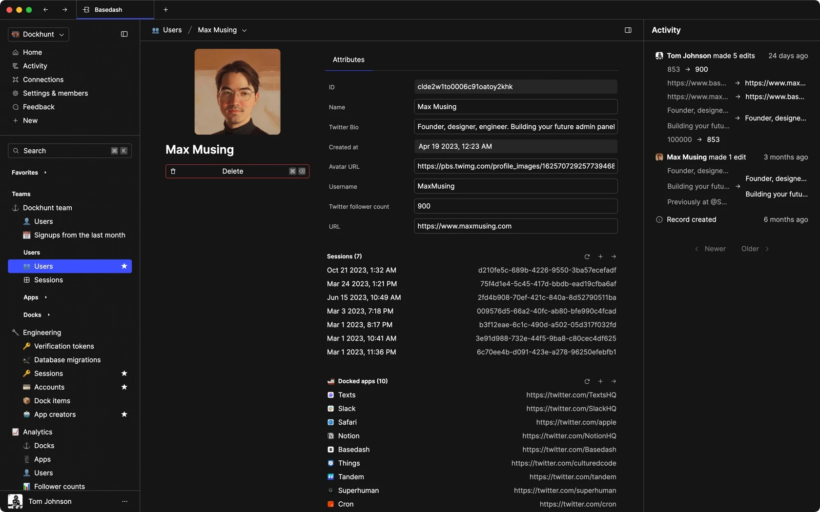
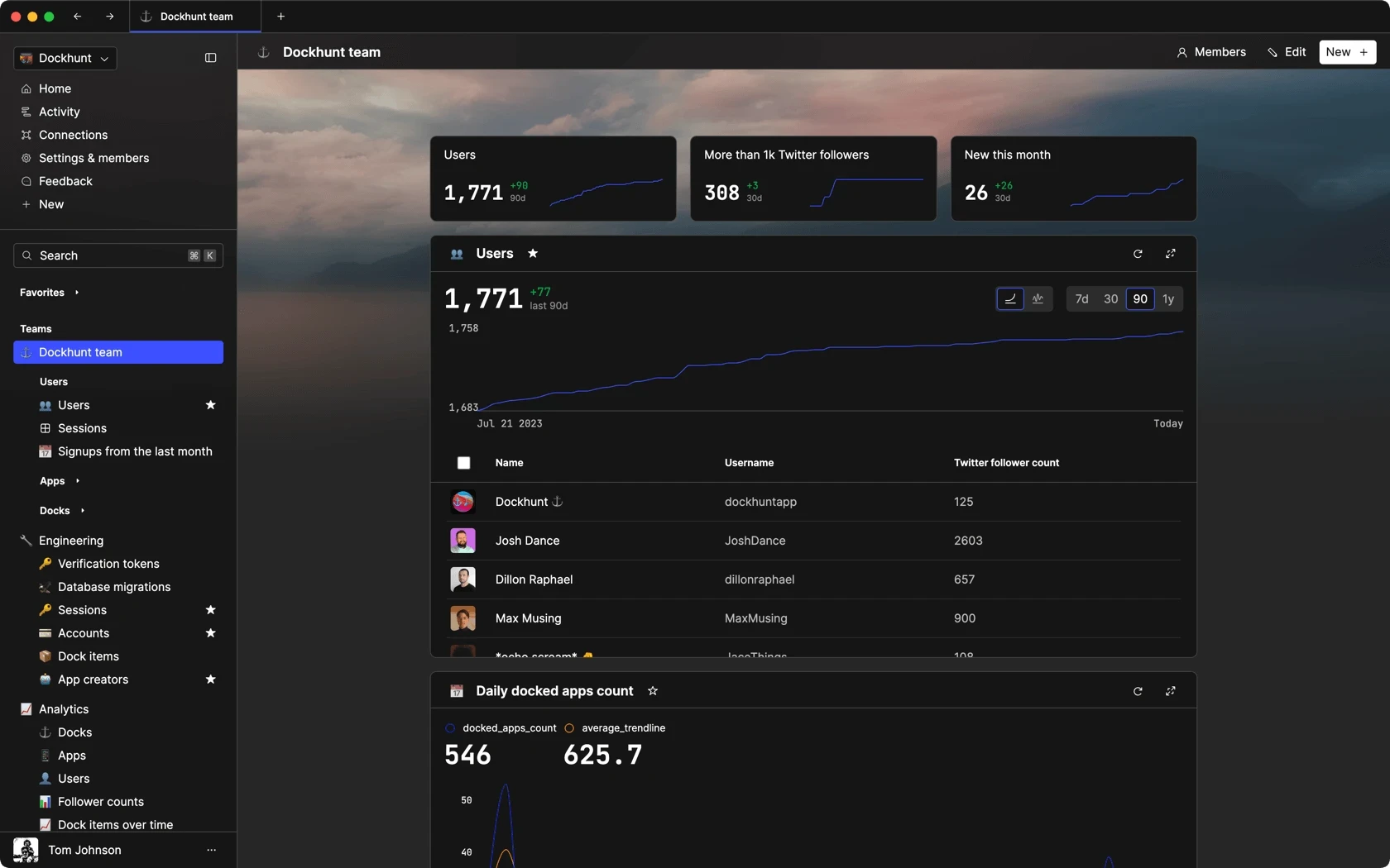
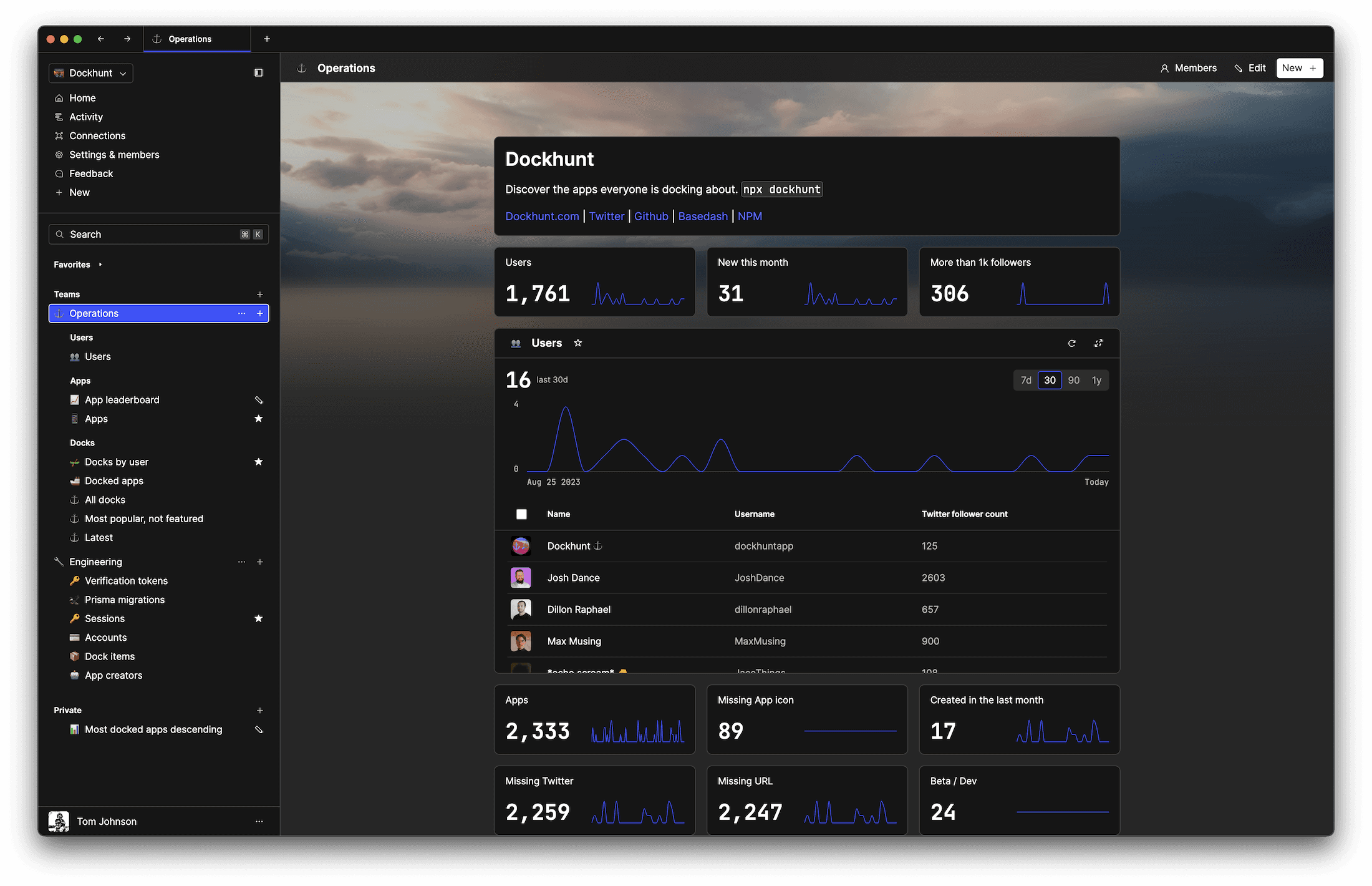
Dashboards and charts
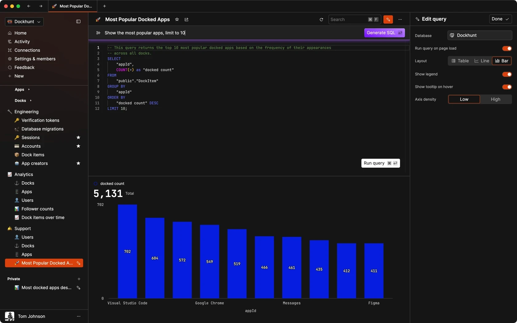
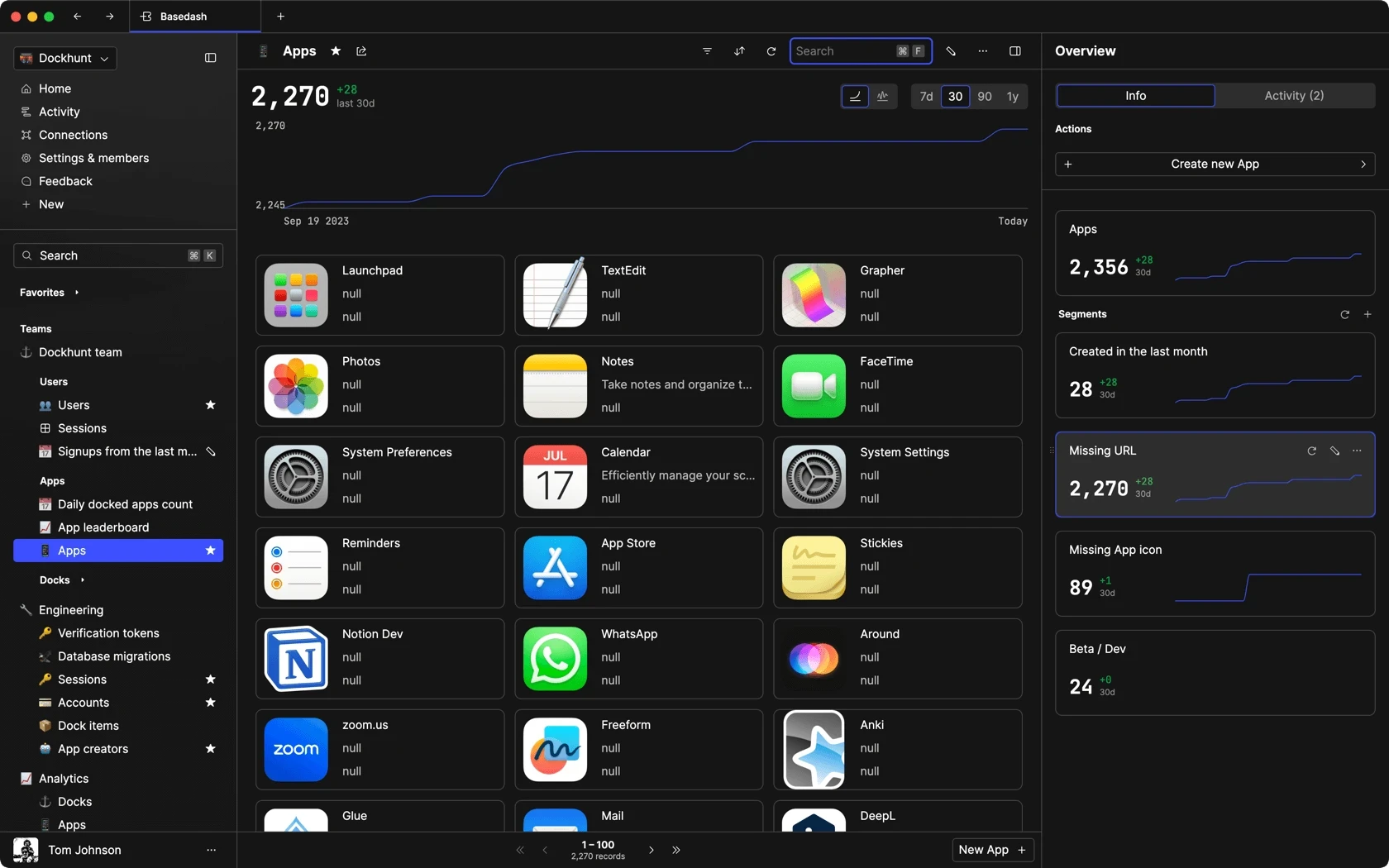
Edit data, create records, oversee how your product is running without the need to build or manage custom software.
USER CRM
ADMIN PANEL
SQL COMPOSER WITH AI
Related posts
Related posts
Related posts


How to Center a Table in HTML with CSS
Jeremy Sarchet



Adjusting HTML Table Column Width for Better Design
Robert Cooper


How to Link Multiple CSS Stylesheets in HTML
Robert Cooper



Mastering HTML Table Inline Styling: A Guide
Max Musing



HTML Multiple Style Attributes: A Quick Guide
Max Musing



How to Set HTML Table Width for Responsive Design
Max Musing
